Originally posted by macdon02
View Post
-
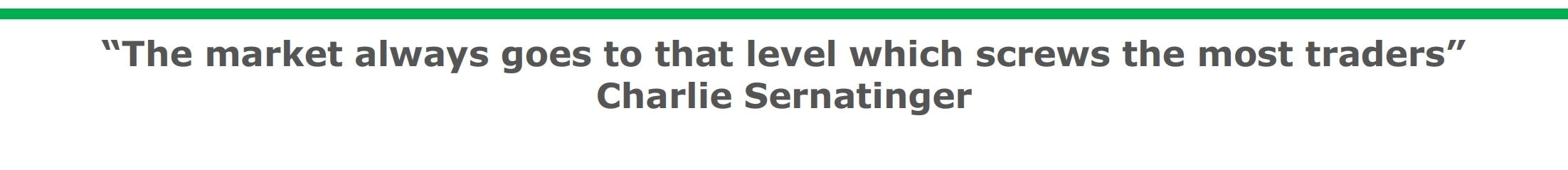
This is the most important thing to keep in mind. Print it. Frame it. I suspect we are gonna get price action to suck in both sides. There's a new low coming. This coming week will be better to watch then participate.Comment
-
Comment
-
Something to consider:
Allied Healthcare Products Inc. was up 1829% at one point on Friday over last week's closing price.
Closed this week up 975% from last week's close.
The company makes respiratory health products that are in short global supply.
It's just crappy investing and poor timing is all
Comment
-
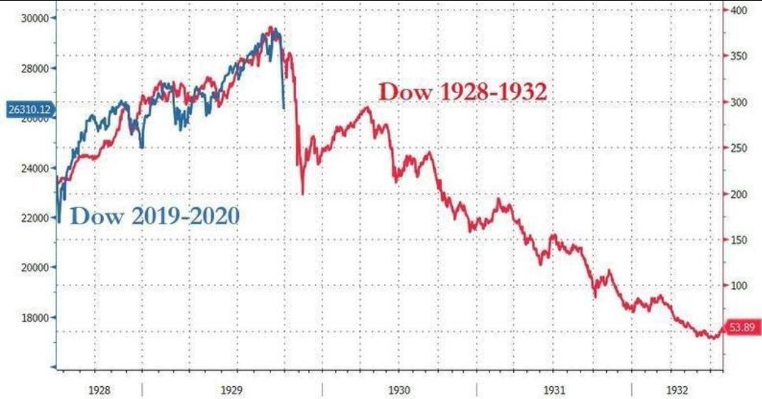
A picture is worth a thousand words, great contribution macdon.Originally posted by macdon02 View PostComment
- Reply to this Thread
- Return to Topic List
Comment