This website uses tracking tools, including cookies. We use these technologies for a variety of
reasons, including to recognize new and past website users, to customize your experience, perform
analytics and deliver personalized advertising on our sites, apps and newsletters and across the
Internet based on your interests.
You agree to our and by clicking I agree.
You will need to login or register before you can post a message. If you already have an Agriville account login by clicking the login icon on the top right corner of the page. If you are a new user you will need to Register.
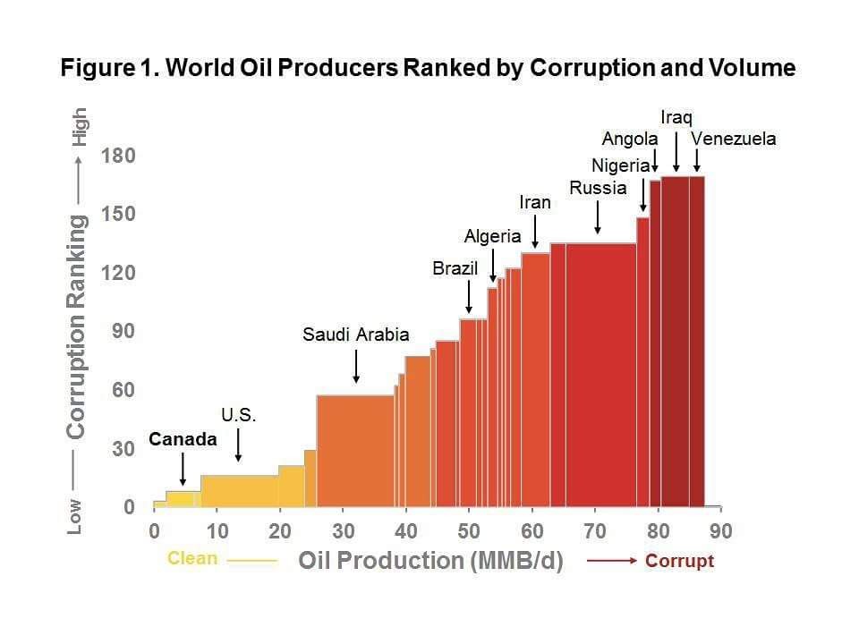
Interesting oil graph. Ethics / volume
Collapse
Logging in...
Welcome to Agriville! You need to login to post messages in the Agriville chat forums. Please login below.
So. Like the old thinking on wheat. We are steering the world with our policies???
Carbon taxing Russia and Iran into submission?
Wow.
Very effective graphic, and puts lie to the absurd premise of the anti-pipeline crowd within Canada, But...
Notice how they have stretched and compressed the width of the bars to make it look like countries with more production get progressively more corrupt? Remove that bias, and the chart wouldn't be quite as effective as it is at first glance.
Should we not be the second highest oil producer in the world? Only in Canada do we leave the oil in the ground because of enviro weenies. We need someone with vision. Someone like Klause.
Should we not be the second highest oil producer in the world? Only in Canada do we leave the oil in the ground because of enviro weenies. We need someone with vision. Someone like Klause.


Comment