
This graph reminds me a lot of the hockey stick graph from Micheal Mann, the one he fraudulently invented to show that the earths temperature had been consistently flat at the perfect global temperature for ever, then suddenly spiked up in the modern era. It was used to justify much of the climate hysteria, taxes, destruction of our energy systems etc.
I would suggest that this hockey stick graph is also an emergency, and deserves an equally large response.
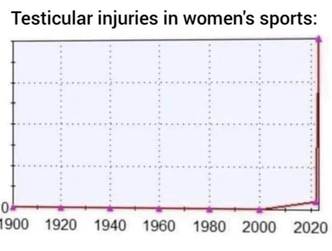
I would suggest that this hockey stick graph is also an emergency, and deserves an equally large response.


Comment